Hey guys! UPDATE!! I have a new professional blog, and a website is on it's way. Here is the new blog!
http://archermwphoto.wordpress.com/
10.06.2010
9.08.2010
Okay, been a while (Swanson's Wedding)
Hello World,
This is Michael Archer, a recent photography graduate from Virginia Commonwealth University. I used to always blog for my class assignments, but now that I have graduated, I feel that it is crucial to continue, at least once a week with new imagery, whether from a wedding, or just me shooting around. So this post has imagery from a short while ago, when one of my close friends got married. Daniel and Jenna Swanson tied the knot on July 7th 2010, and although I was not their main photographer, i couldn't resist capturing some shots while I was there. Let me know what you think.
  Talk about a cute couple, plus their ceremony and church was stunning.
  Their wedding occurred in the morning, and the reception had a selection of delicious fruits, pastries, and breakfast-type foods to snack on. I thought this was a novel idea, as well as different flavors for the cake layers.
  Their colors for their wedding were such a complement as well, being a bright orange and a blue teal, making the ceremony a beautiful array of colors. (Yes, the dresses and flowers were really that color). I actually love this last shot, because its one of those 'catch the moment' shots, appropriately named "The moment before Danny rips off his tailored suit, and takes off in teal and orange spandex to save the world, because the world needs saving once again" Shot.
 Danny and Jenna, congratulations and I wish the best for you in the future.
Sincerely Michael
This is Michael Archer, a recent photography graduate from Virginia Commonwealth University. I used to always blog for my class assignments, but now that I have graduated, I feel that it is crucial to continue, at least once a week with new imagery, whether from a wedding, or just me shooting around. So this post has imagery from a short while ago, when one of my close friends got married.
 Daniel and Jenna Swanson tied the knot on July 7th 2010, and although I was not their main photographer, i couldn't resist capturing some shots while I was there. Let me know what you think.
  Talk about a cute couple, plus their ceremony and church was stunning.
  Their wedding occurred in the morning, and the reception had a selection of delicious fruits, pastries, and breakfast-type foods to snack on. I thought this was a novel idea, as well as different flavors for the cake layers.
  Their colors for their wedding were such a complement as well, being a bright orange and a blue teal, making the ceremony a beautiful array of colors. (Yes, the dresses and flowers were really that color). I actually love this last shot, because its one of those 'catch the moment' shots, appropriately named "The moment before Danny rips off his tailored suit, and takes off in teal and orange spandex to save the world, because the world needs saving once again" Shot.
 Danny and Jenna, congratulations and I wish the best for you in the future.
Sincerely Michael
7.01.2010
4.26.2010
Ryan Gander: Artist Blog
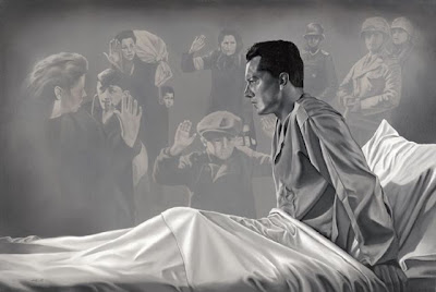
Ryan Gander is an artist born in Chester, United Kingdom, in 1976 and is an artist I have recently discovered through one of his images that specifically stood out to me more than his others. In 1999 he graduated from Manchester Metropolitan University with a First Class degree in Interactive Art, and has been successful as an artist, winning the DENA Foundation Art Award in 2007, and the Paul Hamlyn Award in 2008, to highlight just a few of his accomplishments. He currently works mainly in London and Amsterdam.

The piece above is one of his pieces that really stood out to me when I was searching for more artist influence that I can talk about and be aware of as I create my own work. What really caught my attention in this photograph is the simplistic nature to both composition, and the so-called “rules to photography”. His piece does not follow the rules in technical sense, with the pole sticking out of the main focus’s head, as well as having a semi-distracting background. However, with this being acknowledged, I feel as if Ryan Gander purposefully knew about these things, and was aware of what he was doing when he pushed the button. It’s not that he is unaware of some technical aspects that were not edited or taken care of, it’s that the focus is on the person in the middle, his expression.
To explain this, as most of you know, my work has to do with bleeding of color from my person, bleeding out to the background. Ryan Gander’s piece does that as well, only metaphorical, rather than visual. He is not going to ‘pretty up’ a photograph that speaks with the main focus, and how the world is viewed through that person. In my opinion, the man in the piece is the main focus, and by his face and body language, life has hurt him, and he is searching, therefore, why should the background be perfect, clean, and obey the ‘rules’. The world of photography, is partially to picture life, as is, with all of its blemishes, because this world is not perfect, and not following the rules has everything to do with the story behind this work.
As for the actual imagery, I can relate, because it honestly looks like a representation of me, and what I feel inside. I think that his piece communicates very strong towards anyone who has had an experience that shakes the pillars that each of us build our lives on, and I think that it speaks to everyone in some aspect.
http://www.artnet.com/artwork/425766663/111910/ryan-gander-man-on-a-bridge.html
4.22.2010
Paola Antonelli Artist Lecture
Paola Antonelli is a designer that came to VCU to speak about her work that she does at the Museum of Modern Art. She graduated from the Architectural School of Milan. She focused her talk on the use of design in the present day, as well as how design is much more involved in the arts than normally perceived. She also mentioned specific ideals that were present in art, and especially design. Firstly, she talked about balancing the goal and the means, and how to use it effectively. We, as artists should not try and get all we can, but rather use what we already have in our means in the best way possible. Another part of this idea of using your resources to the fullest is displayed in her next point she discusses.
She emphasizes the benefits of what she calls “an organic path”: walking through your art that you follow, acting upon it with your means, and doing what you want and love to do, which will all lead you in the right way. She talked a lot about how we as artists and designers need to be able to stand on our own, sticking by the work we create and love, and being proud of what we do. These things will lead us to being able to make a difference. She seemed extremely focused on giving motivation, focusing on ways that we all can be happy, and not necessarily be rich in. The ways she described helped me understand that doing what I want to do, rather than doing what will make me money is what you should aim for, so that through the hard times, you will be motivated to continue, where you might be more inclined to give up what you are doing, if you do not want to do it.
Her final piece of advise was to leave some of the story unfinished in your work. People like to finish your sentences, and if you leave a little up for interpretation, then you capture the audience in a way that they had to think about the work to understand it. Her talk was very enlightening, but it focused on how artists should focus doing what they want to be happy.
4.19.2010
Alfredo Jaar
Daniele Buetti was born in Fribourg, Switzerland in 1955, and after she finished school, she became a professor at the Kunstakedemie Munster, and lives in both Zurich and Berlin. One of her pieces caught my eye, in the use of her expression and emotion that is depicted through her work. The piece below reminds me of a piece that would represent different stages, angles, and feelings of my own personal struggles with my own identity.

In the photographs of this montage, she has people photographed with marks, and scars on their body that represent, in my own opinion, the individual issues that each of these people have that obstruct their own finding of love. The piece is called “looking for love” and the marks on each of them reflect on the fact that everyone has issues with searching for love, and the difficulties, the consequences, and the reactions of such a difficult thing to find. Personally, being that I used to identify with this subject specifically, I find a strong and powerful reaction to this work, but it can also be looked at with a slight twist. I think that the marks and burns can represent the internal self trying to break out, as if it was someone completely different, like in my case. I also feel that my subject matter reflects and responds to everyone, and that they can relate somehow to an alternative or internal struggle. This piece seems to tell that the internal struggle is love, and that it is trying to break out, to show the true person inside. We are all broken people inside, and we try to hide that, however, this piece shows that searching for love involves and is directly related to the broken person inside of yourself. That person needs to be realized as much as the exterior person. This whole idea can be directly related to my own work about identity, which is why I feel this piece is so strong and powerful.
http://www.artnet.com/artist/3284/daniele-buetti.html
http://www.artnet.com/artwork/425971213/171564/daniele-buetti-looking-for-love--good-fellows-pinwall-nr-36.html
4.12.2010
Vasco Araujo: artist blog
Vasco Araujo, an artist whose work I have just discovered, was born in Lisbon, Portugal, in 1975. He schooled at the Faculty of Fine Arts of the University of Lisbon (FBAUL), and graduated with a degree in sculpture in 1999. A year later, he went through an advanced course in Fine-Art at Maumaus, School of Fine Arts and Photography, which is also located in Lisbon. Of his pieces, he created a set called “All that fall” in 2009, which are currently at the Galeria Filomena Soares. Below are three of the images that I react to the most.


These pieces are pieces that remind me of a struggle, difficulty, or obstruction of mental or psychological understanding within himself. These pieces strike me hard, as if they speak to a defeat or a giving up of one side of a personal battle. To me, it represents the physical and expressed side giving up and letting the inner side take over, leaving the actual physical action and persona as dead, limp, or immobile. I feel that I cannot express this because my internal clash has been set up that neither side wants to win, but both sides are at battle for prominence. One has to be alive to keep the other alive. It’s a little like the batman analogy: if there was no joker, there would be no need for batman. However, in Vasco’s work, one side has clearly over dominated the other, leaving the physical one as the loser, and leaving it weak and dead. This work is absolutely amazing in my opinion, and love the feeling it gives me when I look at it.
http://www.artnet.com/artist/424625363/vasco-arajo.html
4.08.2010
Barriers: Their place in my work.
The newest part of my artwork and photographs will be the inclusion of barriers in the background as a key or representation of something that separates places, people, and things. The inclusion of these physical objects will be in the background, and probably won’ t be actually separating two of me physically in the image, but it is there as context clues, as something that is there to emphasize and reinforce the work. One of the definitions of a barrier is something immaterial that impedes or separates. In my own work, the barrier is a physical material, but resembles and reflects the separation of something immaterial, personal, and intimate. The large barriers first came from me watching a movie called Wings of Desire, a very powerful movie, where the Berlin Wall was used as a barrier. The wall was never actually addressed in the piece, yet it lingered in the background to emphasize a separation and difference within and throughout the film. This is the same effect that I want to give off with the use of a barrier of sorts in the back of my own pieces. I feel it functions just as other tools that I am using, including the reflections, color, bridges, and rope. Below are just a few examples of what I mean by a barrier, but it doesn’t necessarily have to be a wall.

 http://www.merriam-webster.com/dictionary/barriers

 http://www.merriam-webster.com/dictionary/barriers
4.05.2010
Cang Xin is an artist born in Suihua, in the Chinese province of Heilongjiang in 1967. Surprisingly, Cang Xin was a performance artist originally, and studied at the Tianjin Academy of Music in China. He currently works in China, and creates art pieces that I feel have a similar style to my own work. A specific collection I am referring to is in the Deborah Colton Gallery, and in this series, he talks about an identity exchange. In his images, he is photographed taking the identity of others physically, by wearing their clothes in their environment, and stands next to them, half naked and almost out of place. I get the feeling that both himself, and the one he takes the identity from feels somewhat naked, in both mental state and physical place. In relation to my own work, I put emphasis on the clothing as a way to express the mental state I am going through, and it is good to hear and see that others are using physical objects such as clothing to help successfully explain the internal struggles and problems of people. Pictured below are some of the photographs of Cang Xin’s work.


http://www.artnet.com/ag/fulltextsearch.asp?searchstring=identity¤tCategory=Artwork&page=3


His work really shows a different way of expressing a similar issue that I am dealing with. It’s given me an idea of how I could express my identity problems in another way. I thought of creating portraits of me from others, in a collage style piece. Maybe in the future, I will explore this style a little more.
http://www.artnet.com/ag/fulltextsearch.asp?searchstring=identity¤tCategory=Artwork&page=3
3.29.2010
Artist Blog: Wim Wenders: Wings of Desire
This post is about an artist named Wim Wenders, who directed a movie called “Wings of Desire” in 1987. I am using him as an artist, because his direction of this movie directly relates to my own work. The movie is based in Berlin, and focuses on angels that hear all the thoughts of the city, and watch over the city, sometimes whispering thoughts inside of other people’s heads. The main characters are two angels, which have been alive and together since the beginning of time. One starts to question his life as an angel, completely devoid of time, place, and touch. He starts discussing thoughts of joining the real side, an analogy of crossing the wall. He falls in love with a human, who can feel his presence, but does not see him, and she herself is looking for someone to fill that empty space. What eventually convinces him is his encounter with a human who recognizes his presence, and shakes his hand. The human talks to the angel, though the angel can’t respond and cannot be seen. The way this is shown is through the use of color, and the absence of color. When looking through or in the angel’s life, the world is a sepia tone, and devoid of all other colors, but in the real world, the color is normal and vivid. The human convinces him of all the things he is missing out on, and the angel decides to make the crossing into the human world. He finds the girl, and they fall in love, but the human who convinces him also turns out to be an ex-angel as well, which helps him understand an angel’s presence in the world.
This movie stood out to me because it uses color in very similar ways, as well as discusses a variety of worlds that are separated. I started to pay attention to subject matter that seemed to be recurring in the movie that might help explain this separation of space, and found out that a lot of the shots had the Berlin Wall, or a type of barrier presented, in representing a blockade or separation. This could pertain to my own work, in focusing on my own technique of photographing. I could include more barriers of sort that separate the two of me in each image, not necessarily blatantly sitting in the middle, but have a type of separation other than reflection and color. The use of a barrier, even if it does not split both of me and if repeated, should be picked up by a viewer in my work, and can take context clues to place that type of object as having significance in my work.
Below is the IMDB website, and the preview shows a little example of the story, and the separation of color.
http://www.imdb.com/title/tt0093191/
3.27.2010
Anderson Gallery Pieces:
At 3P.M on Tuesday the 23rd, I put two pieces of mine, from a year ago, titled "21st Century Business. The pieces, were a commentary of the hidden 'transactions' of the business life today. The two pieces were titled "Full Service", which shows an after work solicitation, and the second titled "Saving on Recycling", which looks at the waste a business can create, with no regard for others. Here they are pictured below.


3.22.2010
Artist Blog: Behrouz Rae
Behrouz Rae is an artist born in 1979 in Azerbaijan, who became an Iranian citizen after he moved shortly after being born. He received his Bachelors in Photography at Azad University in Tehran, Iran in 2006, and still lives and works there in Iran. I became captivated by two of his pieces that I discovered in my artist searching. The following images are the pieces that I feel symbolize work that relates to me.


I like his use of extreme blacks and extreme whites. I want to explore and play with blowing out the photographs of my own work to see what that looks like, taking the focus even more off of the background, so the viewer is forced to react with the hidden meanings behind my work. These two pieces speak strongly of hidden undertones, and I feel that part of that has come from the simplistic background, and blown out tones within the piece. It puts emphasis specifically on what the artist wants the focus to be on, and nothing else. Being that I have already gotten my own work printed for the midterm critique, I will start playing in Photoshop with these tools, to see if it works well with the work, or is just too much manipulation. I want to stay away from manipulating my photographs too much and this might just push my images too unrealistic. I really enjoy his work, however, and the blown out and simplistic focus on the piece really brings his work together, and I feel the same might work for me.
3.15.2010
Artist Lecture (03.08.10) Erik Brandt

Erik Brandt is an artist who got his visual communications Masters in 2000 in graphic design, from VCU, and returned on Monday as a visiting artist, an experience which he concluded was something he had been looking forward to for a long time. Since graduating from VCU, he has been teaching as well as creating his own work. His focus of interest is in globalization, and his main medium of choice is typography. He stated that part of his main focus is to contextualize everyday issues around the world in a way where we step back and actually ‘slowly read’ through the information given to us. I feel that as a visiting artist, he has to be one of the best at interacting his audience. Something that one of his old VCU professors taught him to do as a commencement action as well as a way to release nervousness is called “Banzai”. Upon entrance to the theatre, we were given newspaper hats that, at first glance were unidentifiable, but we were requested to wear it into the theatre, and while we were sitting. Then, after a small introduction, Erik counted down in Japanese, one, two, three, and then we all yelled BANZAI!, and the hats were actually Japanese Samurai hats.
The rest of the artist lecture did not impress me as much as his little drill he performed at the beginning, partially because I kept going back to his interaction with us. His work was very interesting and did sometimes touch on some sensitive issues such as a video he did that was post-9/11 that brought light to issues people already knew, but were still sensitive subjects. He also talked a lot about how people “ have started to get society to start taking care of brands, like a need to brand something again and again”. He spent some time in Doha, Qatar, while he was on the exchange program, and he photographed trucks that had been hand painted with a specific brand, as if that gave the vehicle some wealth. They were giving their beat up trucks value by assigning brands, which is a scary thought, especially because people do put so much emphasis on a brand, whether it is clothing or a car. The picture above is an example.
Erik Brandt brought up ideas about society and global issues that affect everyone, yet he also focuses on such specific issues in differing cultures that bring light to the rest of the world through one example. I find his work sometimes confusing and erratic, yet there are always more hidden meanings that I find and discover the more I spend on looking at his pieces.
The rest of his work can be checked out at the following link:
3.08.2010
Artist Blog: Pat Rocha
Pat Rocha is an artist I have recently discovered, who was born in Topeka, Texas in 1959, and considers himself as a graphic artist. He has worked for both NBC and Fox as a courtroom artist, but now, mainly focuses on creating his own artwork, as well as teaching private painting lessons. His work caught my eye because of his titles and how they work with the artwork shown. I feel that in my own pieces need an overall title that speaks very strongly with the work, without getting cliché or just downright boring. I think that titles are a crucial part of a piece and unless the title is a good compliment, all other titles will just bring down the work. Here is a piece below, which works really well with the imagery. The piece is titled “The Burden of Memory” created in 2008, and it is helping me consider my own usage of a title, and some possible key words that I could use in that title, being that the subject matter is on a similar wavelength as my own.

Titles need to be properly used so that they are broad enough not to spell out the details of the image, but not too broad so that it does not flow between the pieces. The following picture below is titled “Presence Crossing”, which, to me, it complements the photograph, and tells a separation between what looks like a mother figure on the right, losing a child to the world outside. It hints at, with the usage of the title, a passage of time, like a crossing between the days of old, both in youth, and of society’s switch into a more technological and advanced life. This picture is supposed to capture the moment of the switch, as if it was a ‘jump’ from one, clearly defined, line or box, into the outside new life.
The title will be a huge part of my piece, and I am still working on key words that I should focus on in my own title.
http://www.artnet.com/artwork/425915834/425570766/pat-rocha-the-burden-of-memory.html
http://www.artnet.com/artwork/425613646/425570766/pat-rocha-presence-crossing.html
http://www.artnet.com/artist/425571519/pat-rocha.html
3.04.2010
Dissonance: My artwork changing in style
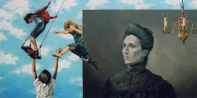
As of late, I have started to change my ideas of how to express my issues with my own identity. With some help from Tom though, I got the ball rolling again. I started searching for ways to express my conflict and internal issues in more ways that could still be drawn back to the same ideas of before, with the same concept, but have a totally different face and image makeup. I started thinking of how I could express a separation, an actual view of ‘two of me’ within a piece without starting to become heavily dependant on Adobe Photoshop, and the post-production of my imagery. I thought back to images of past, where I was in a reflection of a glass pane of sorts, but was not pictured in the actual image. My concept of ‘the struggle’, which has been a running theme throughout all of my work here at VCU, stemmed first from these images, and still feel as if they are some of the strongest pieces I have done. Here are a few examples below.


These pieces got me to think of how I could incorporate myself within an image, and be pictured twice in an image, without questions being asked of where the other ‘me’ came from. I then thought how I could change this shot to resemble the state of myself being separated or being dissonant from one me to the other, as if each one of me, the reflection, and the actual, each stood one representing the Kenyan side, and the other representing the American side. The dissonance and separation between the two of me in the image needed to be pictured realistically, but also needed to clearly show a confusion or separation. I finally thought of the idea of me flipping the reflection of me in one of the images from being a picture that makes sense, to one in which the reflection is opposite of what it is supposed to be. For example, the following image correctly shows the reflection of me in a photograph. Now, imagine if I decided to flip the reflection so that I would face the camera, instead of the reflection showing my back, as it so properly should. I would do this by layering another photograph of extreme similarity of me with the opposite reflection in the window, therefore creating an image that shows disconnect between the two of me in the image. I know that this involves a decent amount of Photoshop, however, I feel as if I am not creating a new ‘me’ in the image, I am just taking another photograph of extreme similarity and layering it on top.


3.01.2010
Abbas Kiarostami: Artist Blog
Abbas Kiarostami is an artist I recently have discovered, while searching the vastness of the internet. Abbas was born in Tehran, Iran, in 1940, and has worked in both film and photography. What captured me in his pieces is how dramatic he takes his photographs, and they can still be understood as works of concept. His Roads series especially grabbed my attention because I feel a specific connection to that work that he created, being that I feel those photographs of his speak on similar lines that my work does. Here are a few images that I especially find intense. 


I feel that these photographs directly speak what I want my photographs to speak to others, because I immediately start looking through my own life at where I am on the road of life, and what struggle is next, or what struggle or 'thing' is holding me back from moving forward.
These photographs are work that I find absolutely inspirational, and I do not want to stop looking at them, because, even in their simplicity, there is a never-ending search for answers to questions, and I look for answers in these pieces for my own life. The work stands as a piece that is uinversally appreciated and understood, as well as having a sense of constant travel and search, as if there is no resting place in the road of life. I feel that in my own work, the reason why I address my own personal issues in the photographs is because I hope that that means I will find a resting place after I sort this major issue that ties me to the past. With this in mind, however, I do feel that part of everyone's journey through life is to find a resting place that can never be gotten, but gets searched for anyway, as a psychological place of rest and peace. That place can be photographed, but I feel that its the search for the impossible, the place of rest, that really tells the story.
http://www.artnet.com/artwork/425974410/118451/abbas-kiarostami-roads-79.html
http://www.artnet.com/artist/9449/abbas-kiarostami.html
http://www.artnet.com/artwork/426014394/425216710/abbas-kiarostami-roads-series.html
2.25.2010
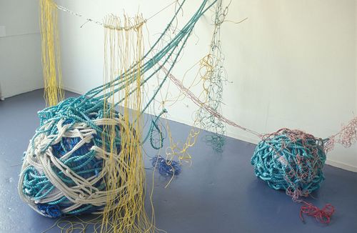
A certain type of baggage: Rope

As most of you know, I have recently been thinking of objects that represent issues that deal with my story. I first came up with bridges as their meaning of being a connection between two places. I am still vastly exploring this idea, but I am searching for more objects of universality that could grab attention of the viewers and then relate to their own lives and their own struggles and baggage that they don't deal with or confront that possibly have been scraping at their insides for quite a while. My work is my own expression of this baggage and conflict that has been bothering me for a long time, but my work, I am realizing has changedd to now shine light onto other's issues by others viewing my work.
I have chosen another item that I feel has the right connotations of baggage as a new object, and the new object is rope. I started brainstorming how to photograph this idea of baggage without losing the main story of my own work, that being the connection to Kenya, and I thought of a photograph where I am still wearing the Kenyan shirt like I have been, but I am carrying a huge amount of tangled rope in my hands, as a burden, and possibly falling down and giving my legs problems as well. I would not recognize the rope in the photograph as existing on its own, because the rope is a representation of this internal burden and baggage. I chose rope because it does not have many other connotations that could be taken wrong, like a suitcase might have connotations. Its not about the physical travel, its the internal travel with these knots and burdens, which the rope is to represent.
I did think about the biggest connotation with rope, the use of it to constrict and wrap around someone, however, I feel that if I have the rope all in my hands, as I am carrying it, and not wrapped around my body, I will be able to avoid these other thoughts and connotations with the use of rope.
Here is a photograph I found (pictured above), representing a huge ball of rope that I would carry, with a few strands possibly getting tangled in my legs, as I travel in the photograph.
Here is a photograph I found (pictured above), representing a huge ball of rope that I would carry, with a few strands possibly getting tangled in my legs, as I travel in the photograph.
2.21.2010
Mark Bradford: Artist lecture
http://www.youtube.com/watch?v=rM3x0XOll30&feature=channel
The above link is a video about a piece Mark Bradford created in reference to identity and issues with struggling with something that 'obstructs' physically, emotionally, and mentally. Firstly, Mark Bradford is an American born artist out of California, and studied at the California Institute of the Arts, where he received both his MFA and BFA. His work above is a piece suggested that I pay attention to, given to me by Tom in one of the individual meetings. In this video, Mark Bradford creates a condition, a struggle, using an antebellum skirt he creates, and wears this huge obstructive piece of clothing that he then attempts to play basketball with. His piece, according to him, is about "road blocks, on every level. Cultural, gender, racial, regardless that they are there, it is important to continue, to keep going, to keep going, and so that was what it was...". This quote has stuck with me for a long time, and it has given me thought as to how this piece that I am creating fits into this notion of falling down, getting up and keeping going.
I started thinking of how my piece is similar to his, where his has a physical obstruction, and mine is all in my head. He talks about his piece dealing with many more issues than just the physical act, and that got me to think about a physical presence of something that represents the struggle. In my own pieces, I feel that this is represented by the shirt I wear in the photographs, and that ties into the pieces enough for people to realize. I also feel that my artwork creates a picture of a similar struggle that his shows, and therefore, I feel that my artwork represents a struggle, that everyone can relate to, and is not about my audience necessarily understanding what exactly I am struggling over, but that they recognize this struggle, and can draw lines to their own lives. My work, I have finally realized, is not about people understanding my struggle, its about, through my expression of my own personal struggle, other people realizing their own personal struggles and issues in their lives. Its supposed to wake them to their own self, and make them examine their lives, in all aspects, as Mark Bradford says. My pieces are created so that others can see their own things they might be running from, or are afraid to face, and now I feel that this piece should be called "Your Awakening" or something to that extent. I am continually thinking about these thoughts, and I really am enjoying this new revelation about my own work.
http://en.wikipedia.org/wiki/Mark_Bradford
2.17.2010
Artist Lecture Hank Thomas

Hank Thomas talked alot about his varying work, and jumped around a bit in his styles and focus. I do feel that one of the most important pieces that he focused on was actually how he went discussing his cousin's death. His cousin was robbed, and then killed, and he dealt with it by expressing it through a few different mediums and art styles. One way he expressed the story was through a stop motion film with action figures, and he re-enacted the whole story out, and how it happened. This of course is such a personal, and I imagine painful way to express his emotion, but in ways I feel it is similar to me, the way we both try and react an emotion of uncomfortability from the viewer, by expressing an event extremely personal to only the artist that creats it. I think the difference is that I am struggling getting my artwork of this personal matter, to be easily understood and seen in the artwork. I learned a few different things from seeing his work, and the way he presents it, so that the viewer can understand and follow. Here are some stills of his work, which he also created to stand separately from the film.

He also went another way with this, which I found even more intriguing and creative, taking the art of concept photography, and crossing it over into the world of commercial photography.
In this work, he portrays the story of his cousins death, and markets it as if it was a commercial for Mastercard. The insanity related this, at least to me, stands out like a sore thumb. The use of a slogan like this, gives me thoughts of how i could possibly market my work as if it was a product. My immediate thoughts bring about how my constant motion and restlessness could be a commercial for Traveler's and how my identity, and all the personal issues inside that deal with this work would just be thrown out the window with no regard to what it might mean. This is definitely something to keep in mind while creating work, and how someone might want to use your photography for something that it was not intended to.
Hank Thomas went on to explain how this launched him to figure out stereotypes in commercials for products of today, and how strong, and abrupt some of them still are. He also created his own pieces that resemble commercial product advertisements, yet had extremely weighted and stereotypical issues and hidden meanings. Overall, I found Hank Thomas's talk really useful in giving me more abrupt and expanded ideas about how identity and my personal issues in my work relate to the outside world.
http://81press.net/wp-content/uploads/2008/12/priceless.jpg
http://chic-cityrats.typepad.com/.a/6a00d83452021d69e201053613009f970b-800wi
2.11.2010
Idea Blog: Color transitioning


Right now, I have established that I need to focus on my color in my pieces. I recently have tried a few different techniques to combat this issue, and try to find better ways to deal with the issue. The main one I started to focus on was to use my clothing as a representation of Kenya, rather than try and edit all of the photographs to imitate shades of colors that remind me of Kenya. The main issue I had with the pieces of last semester was the connection with Kenya and the viewer. I felt like the viewer did not pick up on the hints of Kenya, because the experience of Kenya gave me the idea of changing hues and saturation to imitate shades of Kenya. If they had never been to Kenya, then that specific ideal would not be conveyed at all. So this semester I did some brainstorming of ways to use color to better influence each individual piece. My first idea was with my clothing, as I stated earlier, focusing on a shirt I own that is the National Kenyan Jersey for their rugby team. It clearly shows the flag colors, as well as the flag pattern as the main part of the Jersey, and I decided that the images would be unified by all having those bright and distinct colors and shapes, and that would somehow connect all the pieces. I thought of having a photograph where the shirt is close enough in the photograph so that the viewer can identify with it and directly point it out. I also thought about giving more emphasis on this by giving a gradient of color to black and white from the shirt out into the environment phtoographed. This would also help to influence the idea of separation that I feel internally from the environment I am in now, and give the influence of a 'trying to blend' effect, as if the two identities were trying to mix in this 'one-identity' photograph. They are both competing for the attention, and this is the result of their fighting, a confused and separated photograph. The pictures at the top are examples of what I worked on. I will continue to deal with this issue, trying to iron out a successful and solid idea for uniting the photographs, both in color, and in conveying of the concept.
2.08.2010
Artist Blog: Paul Himmel

(Brooklyn Bridge, circa 1950, Himmel)
(Grand Central Terminal, 1947, Himmel)

Paul Himmel is an artist from the mid-twentieth century, whos work I draw direct connections to my own work. These two photographs directly relate to my work that I have done throughout my artist's experience. The photographs he captures clearly focuses on an emotion, a feeling, an internal struggle for the one that is the focus for the photograph. Paul Himmel was born in New Haven Connecticut, was an immigrant with the rest of his family from Ukraine, and got a degree in Science. He started teaching himself photography, and eventually started working with a professional. He eventually gave up photography and became a psychotherapist. His pieces inspire me because I see so many strong connections to his photographs, as if I had stolen the idea from him. He photographed what I would call hidden photography, capturing successfully emotions and feelings that react all viewers on a personal level, touching a sensetive subject that could be any number of things. The photographs directly speak to me because he captures what I feel through my own photography, the separation, the loneliness, and the blinded friends or people of the world that cannot, or do not understand or connect to his emotions. The main problem with this type of photography is that the photographers will use the medium to convey the separation, and the inner struggle to others, but the people still don't seem to ask or try to understand the emotions behind the person, they just understand that he or she feels alone, separated, and unreachable. I feel that my photography will try and breach that gap, with the use of actual travel, the motion of walking, and the use of bridges as a way to connect with both the viewer, and the inner struggle to which the problem subsides from. This by no means is a solid idea that I am running with, however, I do feel that progress is being made, and that continuing on this path will lead to more successful, beautiful, and strong photographs.
2.03.2010
Idea Blog: A Bridge and a road
The two things that I feel I need to focus on to constantly improve and push my work this semester right now are bridges and roads. Firstly, it is important to understand the function of each thing first in the real world. Bridges are structures that provide a passage over a chasm or object of impassibleness. For me, this takes on a meaning far past just the physicality of a bridge in real life. To me I focus on thoughts of a connector or a way to pass between my two identities inside of me peacefully without struggle and conflict. I feel that the whole reason why I create work that focuses on my identity is because there is no there between the two sides of my life, and will always feel separated and singled out unless I portray the emotional stress and struggles of dealing with this obstruction. In my imagery, I feel that a bridge would depict beautifully my connection between the physical imagery depicted in the photograph to represent the intangible meaning behind my photographs. 
Another word that is related, but can mean or depict various other things, is the use of roads. Roads are simply defined as a stretch of land that has been set separately for travel, normally between two different points. This relates to my work as well, because I feel that the road between my two identities has not yet been discovered, and that I am searching for it through my imagery. The road needs to be built, but it cannot be built without understanding if both sides. Travel is also a clear signal from roads, and because I traveled, creating this alternate identity, I feel that travel and exploration have huge issues and points that relate to this. My challenge is now, how to depict the use of roads and bridges together, without overpowering the imagery, and how do I keep the images unique? These are my challenges with thinking about these issues specifically, and the above photograph is something I took before really diving deep into this work, and will hopefully be a rough draft compared to what I will make out with in the end.
2.01.2010
Daniel Lobdell - Artist Blog

 Spanning Structures 04-P10, 2004 , Spanning Structures 08-SP08, 2008
Daniel Lobdell is an artist I recently have come in contact with, due to my changing imagery as I progress with my work. He is an American photographer, born in 1969, and graduated with a Master in Fine Art in Photography from Tyler School of Art at Temple University. Recently, his work has been viewed and put up for show all over Philadelphia, where he currently resides. The reason I am focusing on Daniel Lobdell is because of some of his photography that directly relates to the issues I am dealing with in my own pieces. The two above pieces, deal with a few techniques that I need to address in my own work, one being the choice of color. Previously, my work focused on having a tint of Kenya towards the photographs, something that reminded me of pigments and hues that I would designate as representative hues for Kenya. The trouble I had dealing with this style was the small differentiations in tints and shading, struggling to get a uniform gradation. I have taken a few photographs in black and white, and I still am not sure how they change the imagery of my own and I plan to continue to search for a solution. In relation to these images, I feel that color might have changed the meaning and feel of the pieces, and I enjoy the choice of absence. Especially in the top one, there are hues there that hint to pigments I remember from Kenya, and I want to try a mix between black and white, and color.
Another issue his photography confronts is the bridge itself. Bridges started interesting me after I photographed myself crossing a bridge. Being that a bridge relates to a connection between two different ideas, I started thinking of my own search for the connection, the bridge, between my two identities. In Daniel Lobdell's imagery, the bridges are not photographed from on or next to the bridge, in fact they are from below, and that intrigued me, and got me to think about the use of bridges in my own photography. Did I have to be standing or crossing on the bridge for the concept to make sense, or could I use the twisty and winding undersides of bridges to show my confusion and situation with my identity struggle. I am continually thinking and pondering about these images, hopefully getting an answer or clue that will further push my idea.
1.27.2010
Artist Lecture: Alec Soth
Alec Soth is a photographer born in 1969, who is based out of Minnesota, and has been recently established after publishing a few different books of his work. A few different series of his stood out to me in his presentation, including his most noticed, Sleeping By the Mississippi. This series of his work established a long series connection with photographs all somehow relates to each. The connection between each of his photographs is not necessarily pictured in the photograph, but is contextualized through interpreting the imagery. Here is an example from his series:

 Fort Jefferson Memorial Cross, Wickliffe, Kentucky 2002

 Fort Jefferson Memorial Cross, Wickliffe, Kentucky 2002
Charles, Vasa, Minnesota 2002
This body of work made me question exactly why we connect photographs in the way we do, and if we really think through all of the photography we create as to how it relates to the rest of a particular body of work. In the above example his connection between the two photographs was the second man from the left in the first image wanted to have his own flying school, and the planes in the second photograph suffice the connection. This connection would not have been known by the viewer just visually looking, which made Alec think about how work connects with each other, and how important the story behind the image is. I looked at my own work, starting to think about how i am connecting and drawing lines in my own work. His pieces made me realize the importance of how, and what kind of a connection is made between pieces of art, and how that might affect the piece.
He went on, discussing how this pondering of connecting stories and themes reminds him of a story that gets told within imagery. Alec started to focus on a desire for narrative in his pieces to tie them together. This discovery led him to two different pieces, both narrative in nature, one being The Most Beautiful Woman in Georgia, and The Loneliest Man in Missouri. Both pieces interested me because i felt, especially with The Loneliest Man in Missouri, a strong connection to my own work, and how i am making a narrative in my own pieces, where i am "the loneliest man" only in identity rather than meer physically. I feel that his pieces cross much deeper past his titles as well, where the viewer has to really dig for the meaning in the titles given because there is a hidden meaning relating back to the narrative in the piece. I feel that he also has given me a new found respect for titles of pieces, and i will think about how to approach my own piece and title.
1.25.2010
Artist Blog: Michael Kenna
Michael Kenna is a recent artist i discovered while revamping myself into the work i will continue to do this semester. He is a British born Photographer who attended numerous schools in England to pursue his photography. He currently lives in Seattle, Washington, in the States. His work, after closely examining it, is extremely similar in emotion i get from my own pieces. His are purely landscape photography, and beautiful black and white prints, however, his pieces speak to the story behind the image. Each shot seems to tell a puzzle of the piece, or leave the viewer questioning the meaning behind the piece. The photographs tell of a place, and then hints at an underlying story within the piece. Originally, I saw very little connection between his and mine, however, as I kept staring, and taking in the images, i realized that without any human imagery in the pieces, he still conveyed the feeling similar to what I try to give off in my own imagery. The difference between the imagery is that my photography and concept benefits more with my own person in the images, whereas Michael Kenna's focuses on the landscape only to tell the story.
Here are two images that I find relevant to my own images.


Ponte dei Sospiri, Venice, Italy, 1987 Gondola Ferro, Venice, Italy, 2006
These pieces also have given me thoughts of toiling with film and black and white imagery. I feel that the manipulated color in the photographs I took for last semester worked to a degree, however, with slight variations in tone quality, it would be hard to reproduce for so many photographs. I think color is something i need to focus on, however, I am still unsure how to approach the issue, and will continue to contemplate various possibilities.
Subscribe to:
Posts (Atom)